I finally got around to painting some of the Space Marine figures I bought back in the 1980s. Worryingly, they're not the oldest unpainted figures I have…
These figures have followed me through six house moves over the years. They've been individually wrapped in tissue paper, dozing quietly in the same box for more than two decades. As I'm currently on a science fiction kick, I decided it was time to actually paint some of them.
A few of them had been partially built, and a couple had been primed and basecoated "back in the day". However, I'd stripped them a couple of years ago for a Rogue Trader retrospective blog post.

One of the things I like about these figures is that it was before Citadel felt the need to stick skulls and eagles on every spare bit of model. One of the figures has some laurel leaves, but other than that, not a skull or eagle in sight. However, painting large flat surfaces without the figures looking boring isn't as easy as it sounds, so I had a look around for some ideas on colour schemes.
Again, this wasn't as simple as it should have been, partly because I don't play 40K, and I'm not crazy about their universe and story fluff. I've probably mentioned it before, but I lean more towards hard SF, so I'm taking cues from Traveller and various other games with non-Gothic backgrounds (Sedition Wars, Deadzone etc.). This left me with a problem, as Space Marines don't really fit into anything I'm doing. They're heavy infantry with jump packs, but the group I selected had a disparate selection of weapons, which didn't suggest a regular infantry unit. In the end I decided they were an ancient knightly order, with weapons that have been passed down through the generations. How they'll actually play on the game table is anyone's guess.
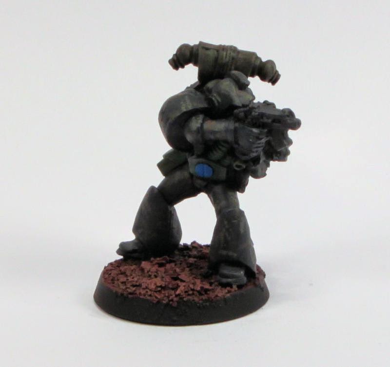
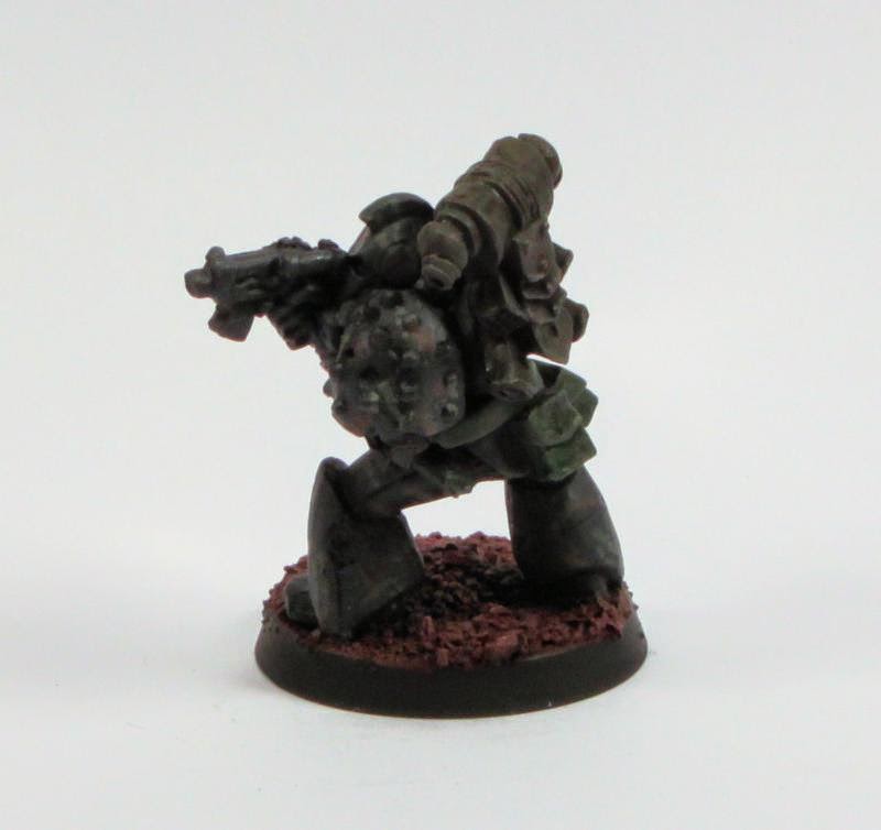
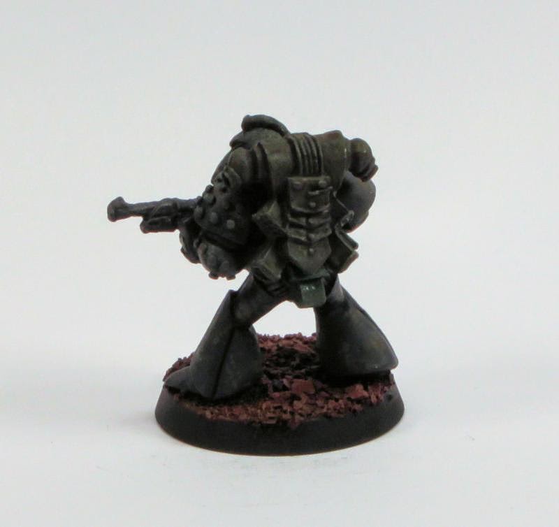
With that in mind, I had a look around at various chapter colours and settled on a Red Scorpions design I found. However, when I came to do the red bit it looked stupid, so I abandoned that. This left me with very dark grey (Andrea Miniatures Black, to be pedantic) miniatures. To give them some variety I semi-stippled on a couple of colours for a camouflage scheme. They're there if you know where to look, but on the table the armour will look black.
I'm more than a little disappointed that, after waiting for nearly thirty years, the figures turned out the way they did. There's always the dettol bath, but for now I have too many things to paint to start repainting figures.
With the various caveats above in mind (assuming anyone read it and hasn't just skipped to the pictures), below are the results.

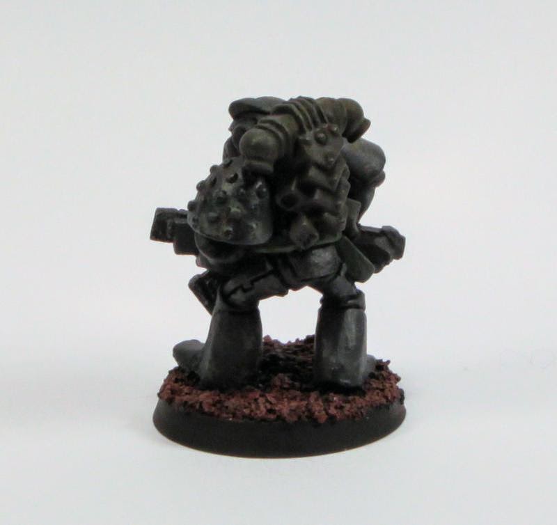
The figure below has a moulded on jump pack, one of their earliest designs


Some heavy support from a multi-melta


A portable version of the same weapon


Not sure what he's armed with


I think this guy is meant to be a tank rider. However, he still works as a single infantry figure


Some more heavy support


And finally, the group shot

I think they look pretty good, but you need to do something with the blue. At first glance I thought you had under coated and then started a blue colour scheme. I like the dark grey - maybe a numeral or a badge or something to tone down the spot colour? I certainly would not be stripping them
ReplyDeleteYeah, I will need to revsit these at some point, one way or another.
ReplyDeleteI think one of the problems is that, as I mentioned, I don't know what part these guys will play in my background, so I'm struggling to place them. I think once I know what they do, I'll know how to fix them.
The blue is quite striking - more so in the photos than "real life", but yeah, it needs something. Numerals sound difficult, so I think it will just be toning them down quite a bit.